- Client
- Polestar Consulting
- Year
- 2025
- Duration
- 3 Weeks
01 · Challenge
The brief.
Poleplus needed a centralized dashboard that gives teams real-time visibility into projects, tasks, and progress. The existing systems lacked clarity, had scattered information, and made it hard to track what truly mattered. The goal was to create a clean, intuitive dashboard that helps teams stay focused, organized and in control.
02 · Approach
The thinking.
We began with user research, and workflow analysis to understand how project managers and teams track their work. The insight was clear — they needed a single overview that highlights what's important without the noise. We designed a minimal, modular dashboard with real-time metrics, priority indicators, and quick access to key actions. Every element was crafted to reduce cognitive load and help users make faster decisions.
03 · Outcome
The result.
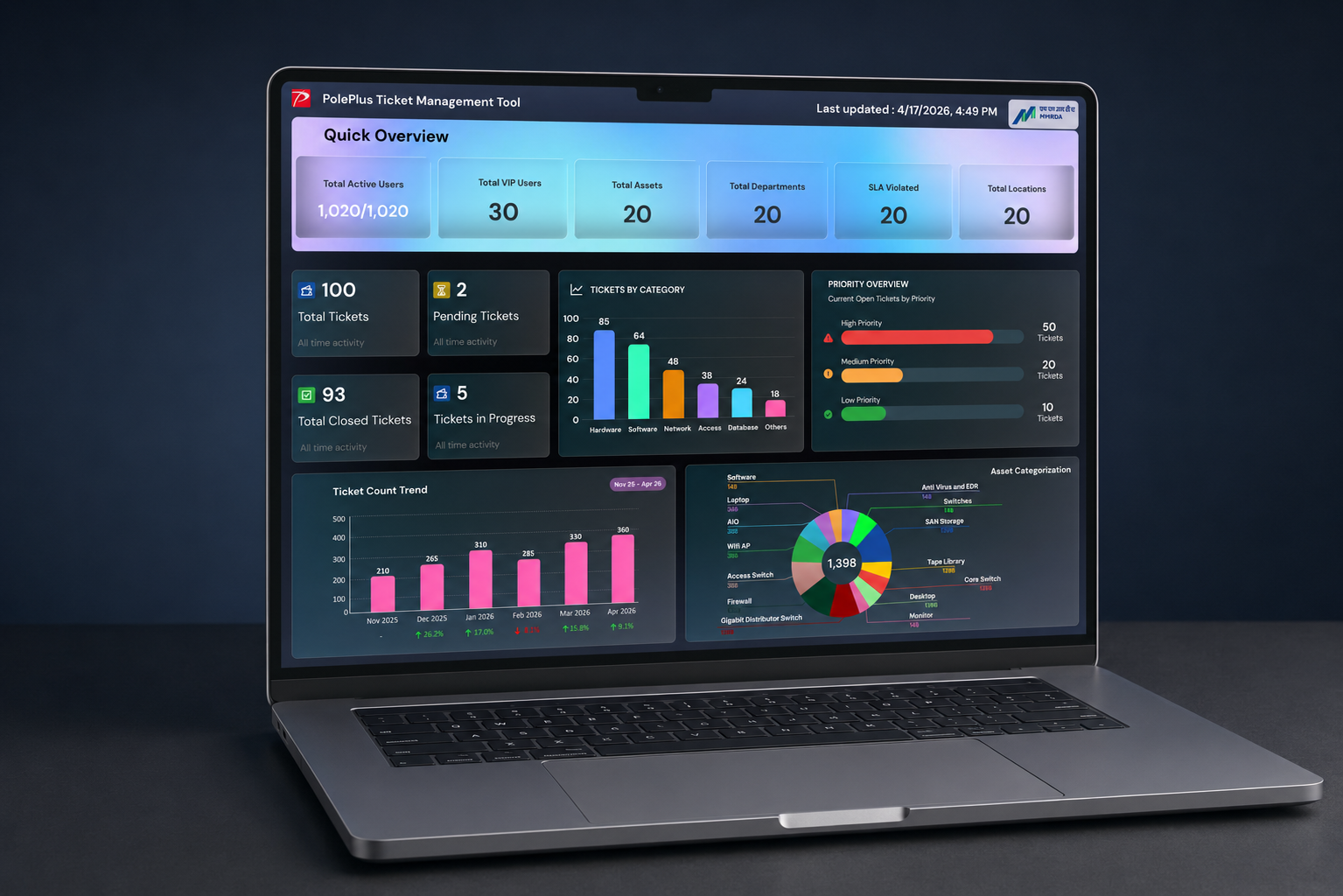
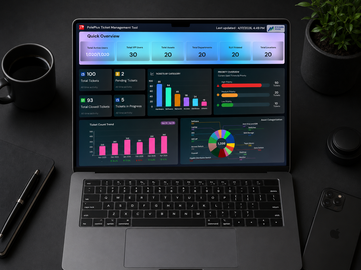
The resulting dashboard consolidates several operational perspectives into one interface.
- Organisational scale
- Current ticket status
- Priority & SLA risk
- Category-level workload
- Historical ticket patterns
- Asset distribution
Rather than presenting the dashboard as a collection of independent charts, we designed it as a sequence of questions an operational user would naturally ask.
The result is a monitoring interface that helps teams move from "What is happening?" to "What needs attention?" with less interpretation.
04 · Key Features
- Executive Dashboard
- Real-time operational monitoring
- Priority & SLA risk insights
- Asset & category views
- Historical analysis
- Export & reporting
- Clean & scalable design system